|
|
Post by julienhb on Sept 17, 2009 3:03:07 GMT -5
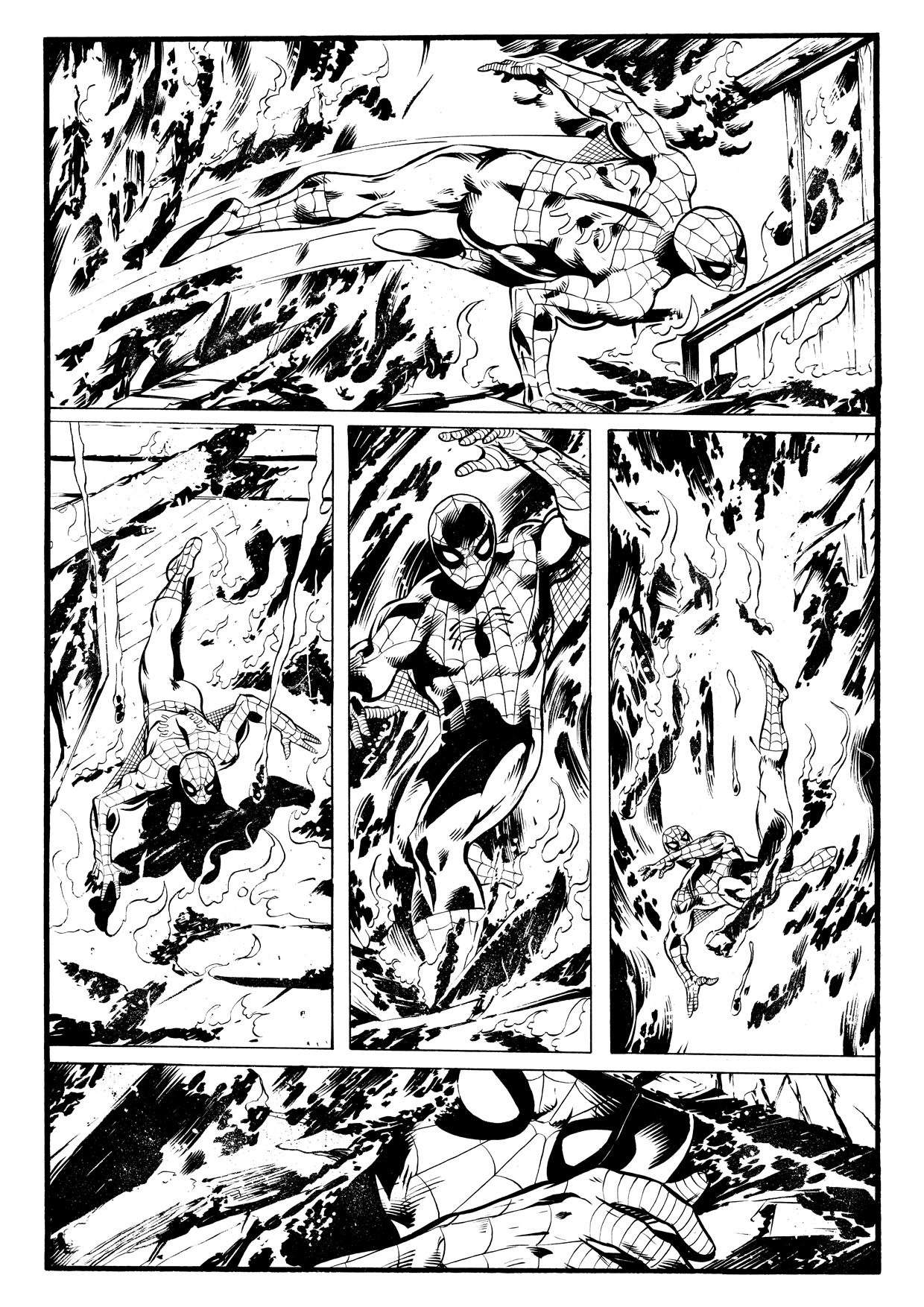
Marvel Team Up #75, page 1 by John Byrne 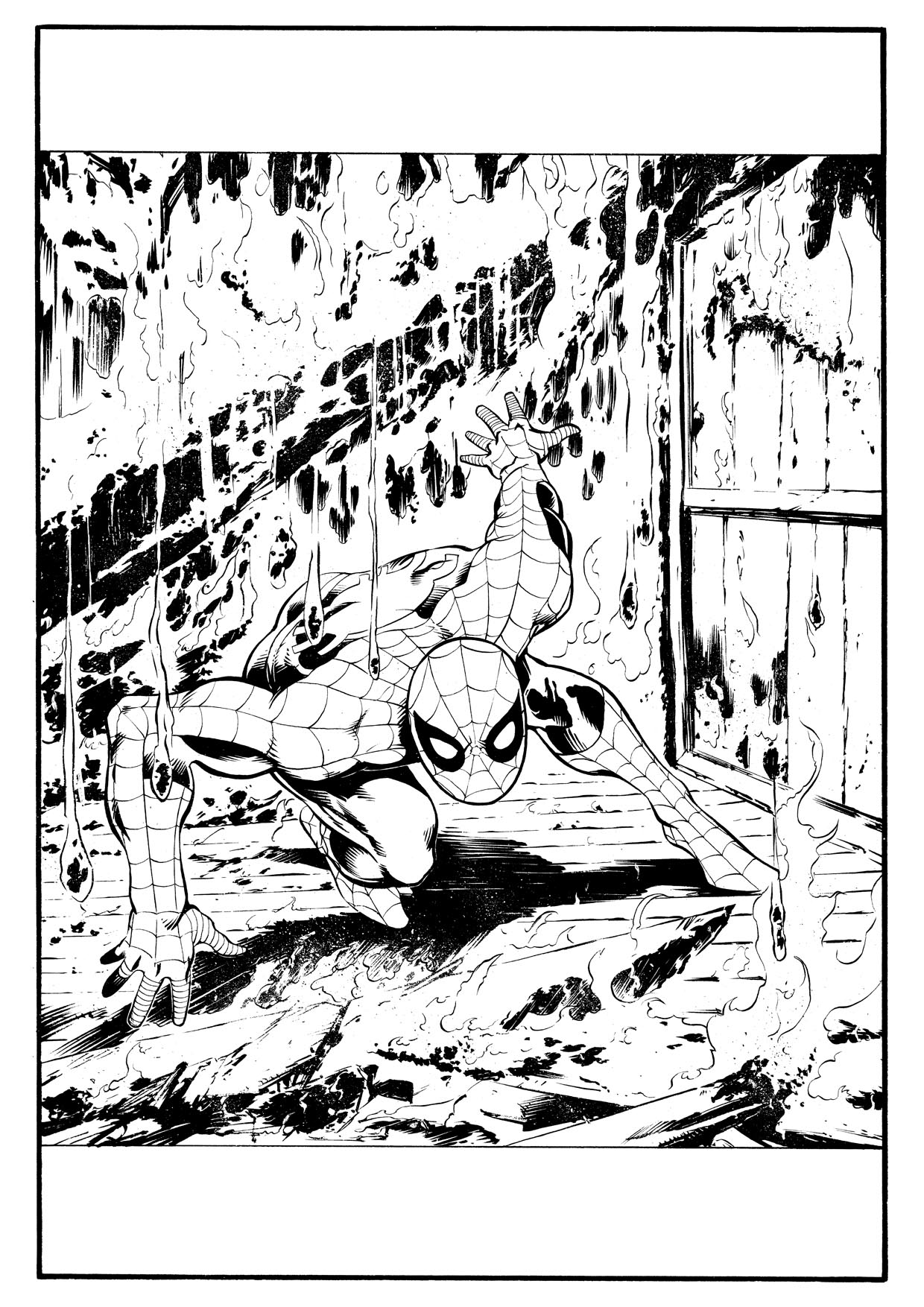 Pencilled page can be seen here: julienhb.deviantart.com/art/Marvel-Team-Up-01-pencils-137290030This is a page I started before the Vampirella pin-up but finished after... So I would say this is my first second attempt with Windsor & Newton brush. I really like that tool... I'm currently inking a 7-page story with Doctor Strange for Marvel UK and decided to use that brush. My advise to all inkers using nibs: give it a try, even if it's not for the totality of the page, it's worth the effort!
|
|
|
|
Post by julienhb on Oct 1, 2009 4:53:26 GMT -5
|
|
|
|
Post by julienhb on Oct 9, 2009 17:13:52 GMT -5
|
|
|
|
Post by clockwerkj on Oct 10, 2009 10:30:37 GMT -5
A little heavy handed as we get to the background. I could see going heavier on the forground. You used alot of halo's where they werent necessary, & didnt where they were. You are definitely getting a better handle on your brush control.
|
|
|
|
Post by julienhb on Nov 21, 2009 5:44:33 GMT -5
|
|
|
|
Post by julienhb on Nov 21, 2009 5:47:32 GMT -5
Hey Jay,
Thanks for the comments regarding halos... I know what you mean and I think I still need to find a good way to use halos. Sometimes it's too much but in spite of what people say ("white lines don't exist in real life" - black lines neither, after all), it's a very good tool to keep the page readable. Well, I'll practice more.
|
|
|
|
Post by julienhb on Dec 7, 2009 9:06:42 GMT -5
|
|
|
|
Post by julienhb on Dec 14, 2009 12:24:48 GMT -5
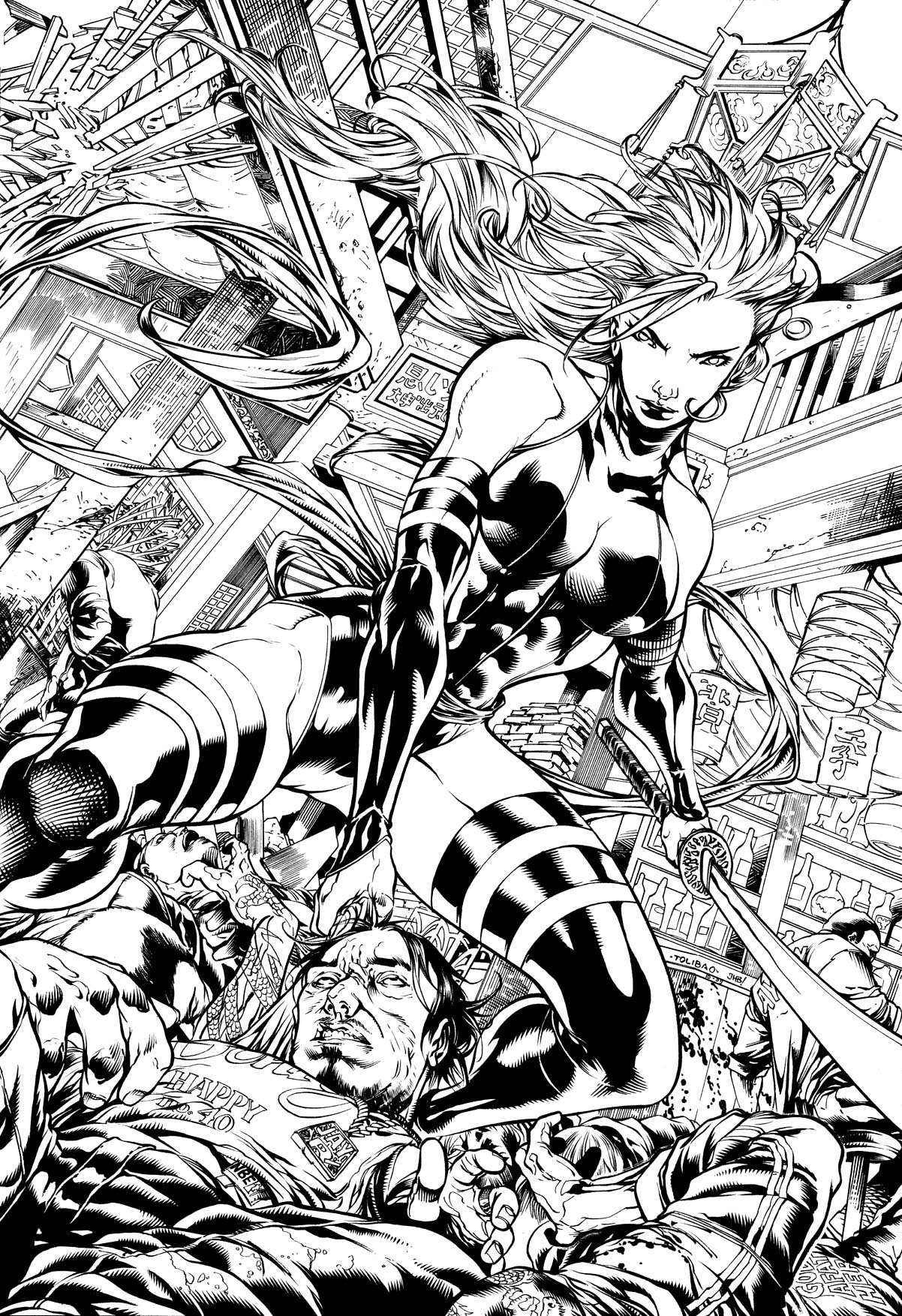
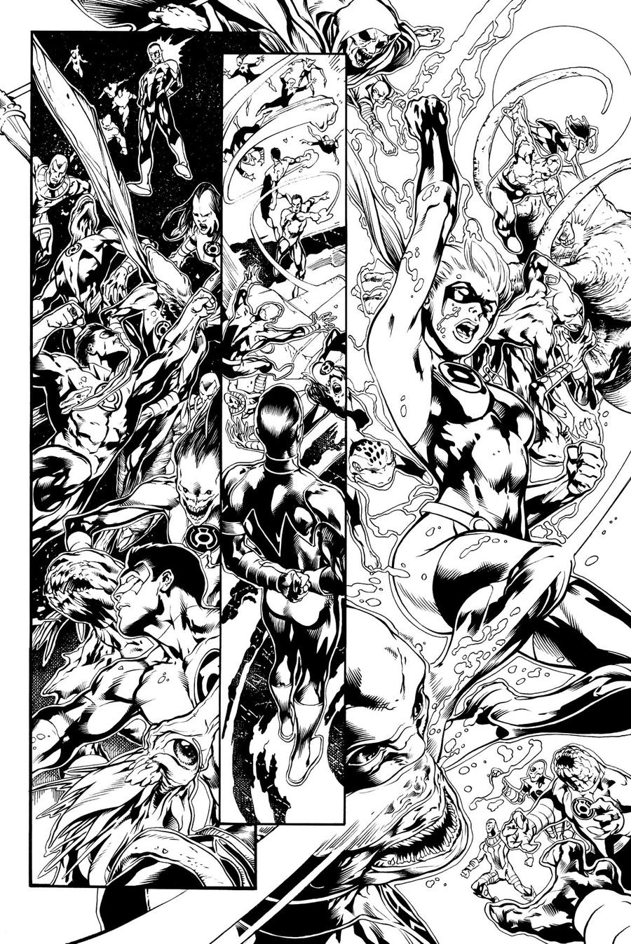
Green Lantern #25, pages 26 by Ivan Reis 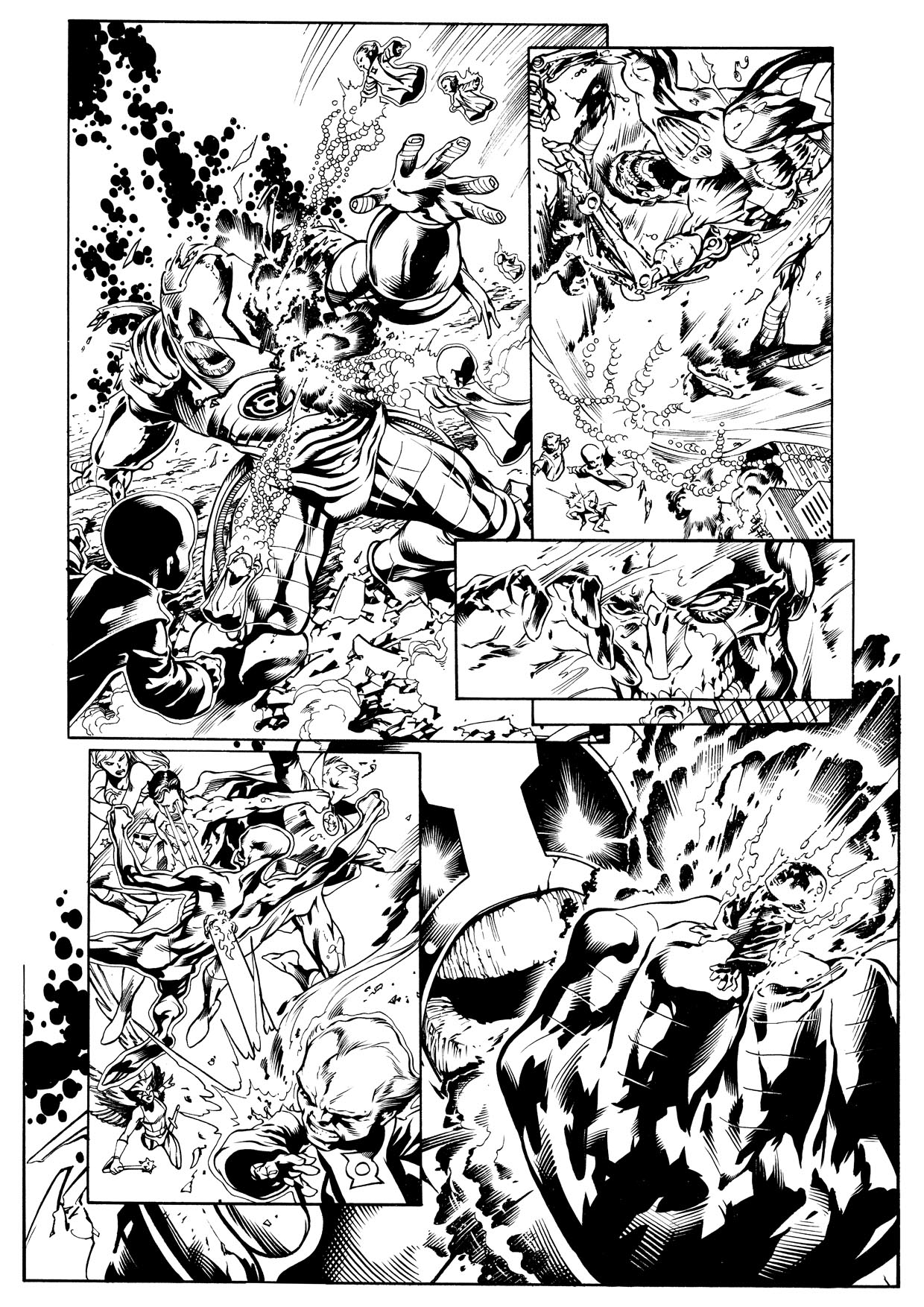 I think I added too much white spots... Doesn't seem enough on the paper, but it seems the scanner sees many many many more specks than me. Nest time, I'll be lighter on the teeth brush. Pencilled page can be seen here: julienhb.deviantart.com/gallery/#Green-Lantern
|
|
|
|
Post by bobalmond on Dec 14, 2009 15:31:44 GMT -5
Yeah, I think Jay has addressed the spattering issue....the way the white specks are laid down here it looks like you scanned from a bad photocopy. Try spattering on an inked scrap paper with the toothbrush bristles being really messed up....try with a little more water mixed into the white correction fluid/paint...try directional spatter where you have a glob of white paint on your brush head and tap it down against something else like a quill holder or even your finger. This should add more variety and texture to your spattering.
|
|
|
|
Post by clockwerkj on Dec 14, 2009 16:56:57 GMT -5
KEEP WORKING WITH THAT BRUSH!
You are getting the hang of it pretty quickly. The splats dont work very well. It takes time. One thing I've noticed is most guys go thru a splatter phase right before they break in. once you get the hang of it you can hide some marginal lines by putting splatter over them. for a realgreat example of that see Ivan Reis & Marc Campos Lady death for cross gen. Marc buried his lines.
|
|
|
|
Post by bobalmond on Dec 14, 2009 17:57:51 GMT -5
I still do <g>
Plus it breaks up the lines from looking too nice and mechanical.
|
|
|
|
Post by julienhb on Dec 16, 2009 6:33:03 GMT -5
Thanks Jay, thanks Bob for your comments.
Concerning splatters, I've scanned it again with darker tone (I was missing some thin lines). A few specks disapeared but it still won't do the trick.
In fact, I'm always surprised by my page on the screen. I lose some thin lines, sometimes it looks heavier... I really have difficulties to scan properly.
At the end of the day, I'm not even sure it's necessary to use splatters, most of the time. The colorist can do it afterwards if needed.
I'm still working on a page by Ivan Reis (same issue) and I think I won't use any splatter on this one.
From what I can remember I liked the Lady Death from Crossgen, but I should have a fresh look to this now - I don't remember how Ivan Reis was inked.
Oh and yes, I love using the brush. I won't give up! It's really a great tool!
|
|
|
|
Post by julienhb on Jan 4, 2010 15:16:29 GMT -5
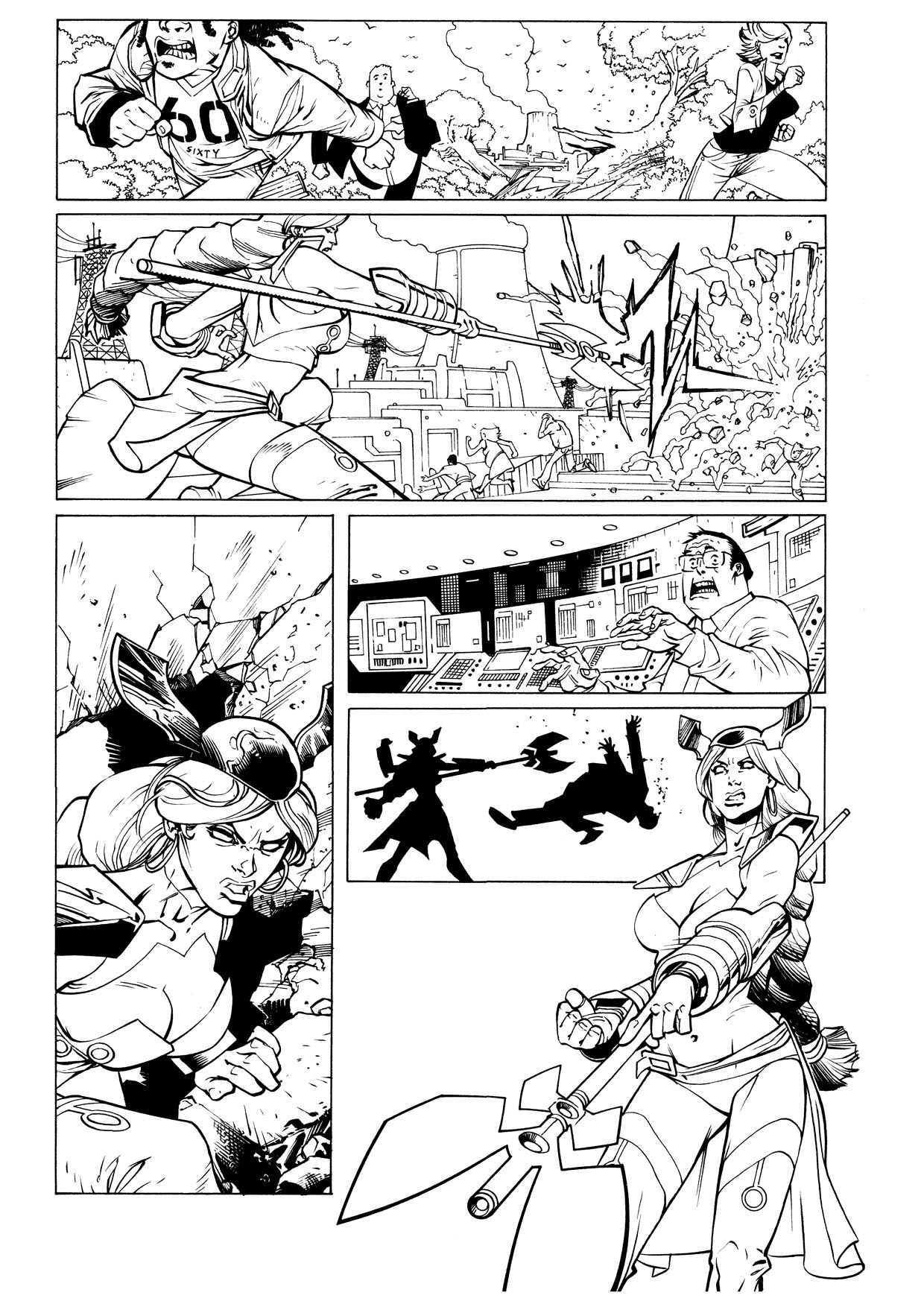
Hey! Happy new year to you all! Best wishes for 2010! Here is a new page to start that new year... Invincible #69, page 1 by Ryan Ottley  Everything is on the pencilled page, and yet, this is more tricky to ink than I thought... Pencilled page can be seen here: wya.deviantart.com/art/Invincible-69-page-1-147674124 |
|
|
|
Post by clockwerkj on Jan 5, 2010 8:40:55 GMT -5
Everything looks solid. I'd think about being a touch more delicate with the lines on the interior.
|
|
|
|
Post by julienhb on Jan 7, 2010 8:14:43 GMT -5
|
|