|
|
Post by julienhb on Mar 18, 2009 17:07:41 GMT -5
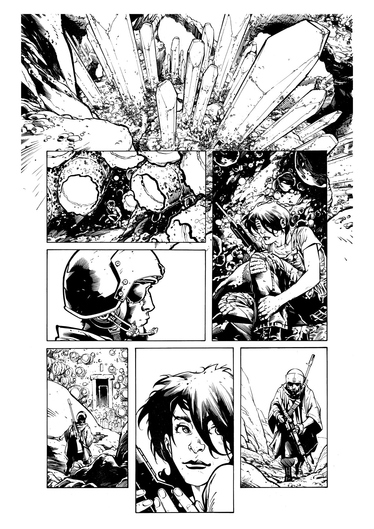
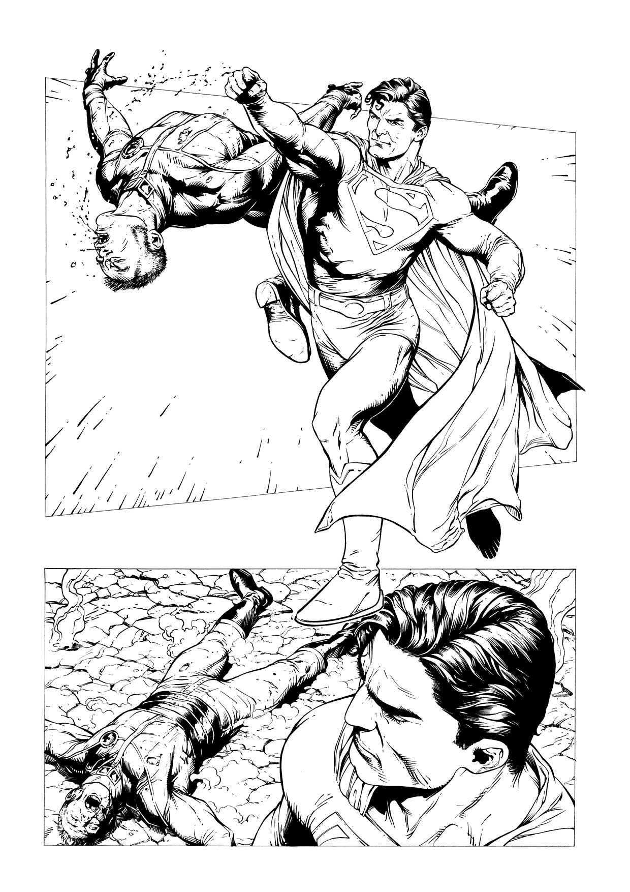
Thank you very much Jay, you may be right, Emma was is heavy (but I wouldn't tell her in front of her)...  To be honest, it was quit eeasy to ink, almost already inked with the pencils themselves. But it's fun! By the way, have you seen my previous message? Regarding assistant work? But I understand you must be very busy... Well, if you have the time, do not hesitate to contact me. Thanks again! PS: I think I was not very good at this Elektra pinup... I don't know why. My lines are not very sharp - almost blury. I'll be away from my table for 1 week, I think it'll do some good... |
|
|
|
Post by clockwerkj on Mar 19, 2009 0:52:20 GMT -5
Hey Julien,
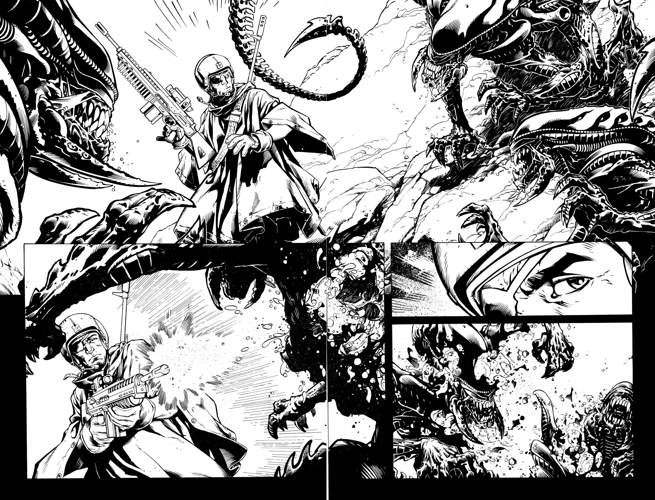
Im not that excited about this elektra. u already discounted it so I wont really get into it. I wrote you a few weeks back kindof giving you the in's & outs of the whole assistant thing. I'll see if I kept a draft to resend.
|
|
|
|
Post by julienhb on Apr 14, 2009 7:06:06 GMT -5
|
|
|
|
Post by julienhb on Apr 24, 2009 6:06:58 GMT -5
|
|
|
|
Post by julienhb on Apr 26, 2009 16:56:06 GMT -5
|
|
|
|
Post by clockwerkj on Apr 27, 2009 0:34:10 GMT -5
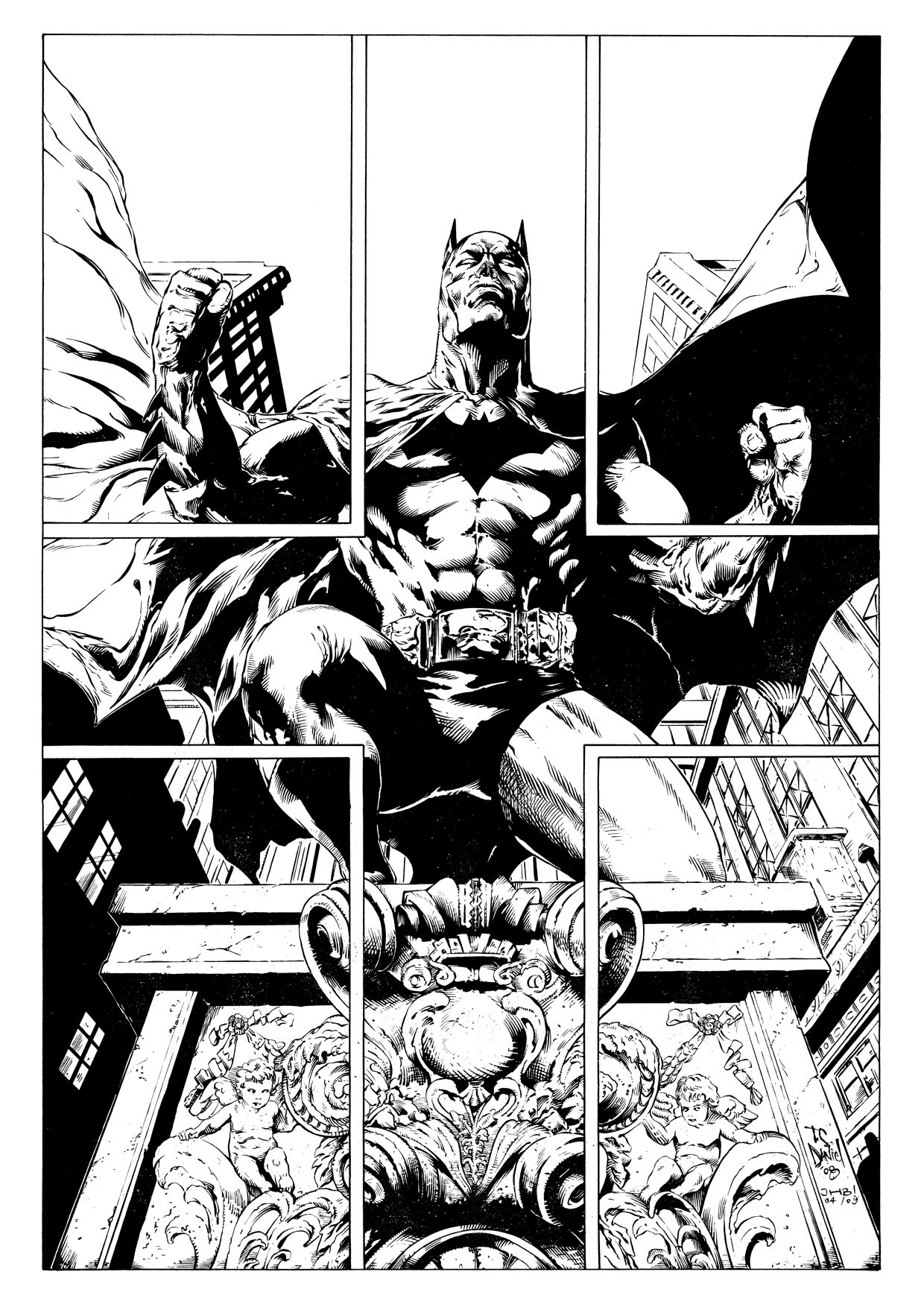
watch out with making things furry. the left leg on batman doenst feel like tight fabric. Its more hairy. Try to keep your lines similar on different surfaces. make th same strokes on the cape everywhere, same for the body suit, buildings etc. if the lines on the objects feel the same on each individual thing it holds up better. you vary line texture from render set to render set. its getting better, but I felt like no-one had commented on your stuff in a while. So I wanted to keep you updated.
J
|
|
|
|
Post by julienhb on Apr 27, 2009 2:42:06 GMT -5
Thanks Jay! I think you've put your finger where I had a problem but could find it...
I'll try to improve this part...
|
|
|
|
Post by clockwerkj on Apr 27, 2009 11:17:30 GMT -5
It takes a while to figure that stuff out. try to make sure that lines intersect in crosshatching with an angle between 20 & 45 degrees. You can do 90 deg also but that usually flatens an object instead of rounding. also try ot make the intersections either at the thinnest or fattest point.
|
|
|
|
Post by julienhb on May 4, 2009 17:47:49 GMT -5
|
|
|
|
Post by julienhb on May 22, 2009 14:29:11 GMT -5
|
|
|
|
Post by clockwerkj on May 23, 2009 12:25:40 GMT -5
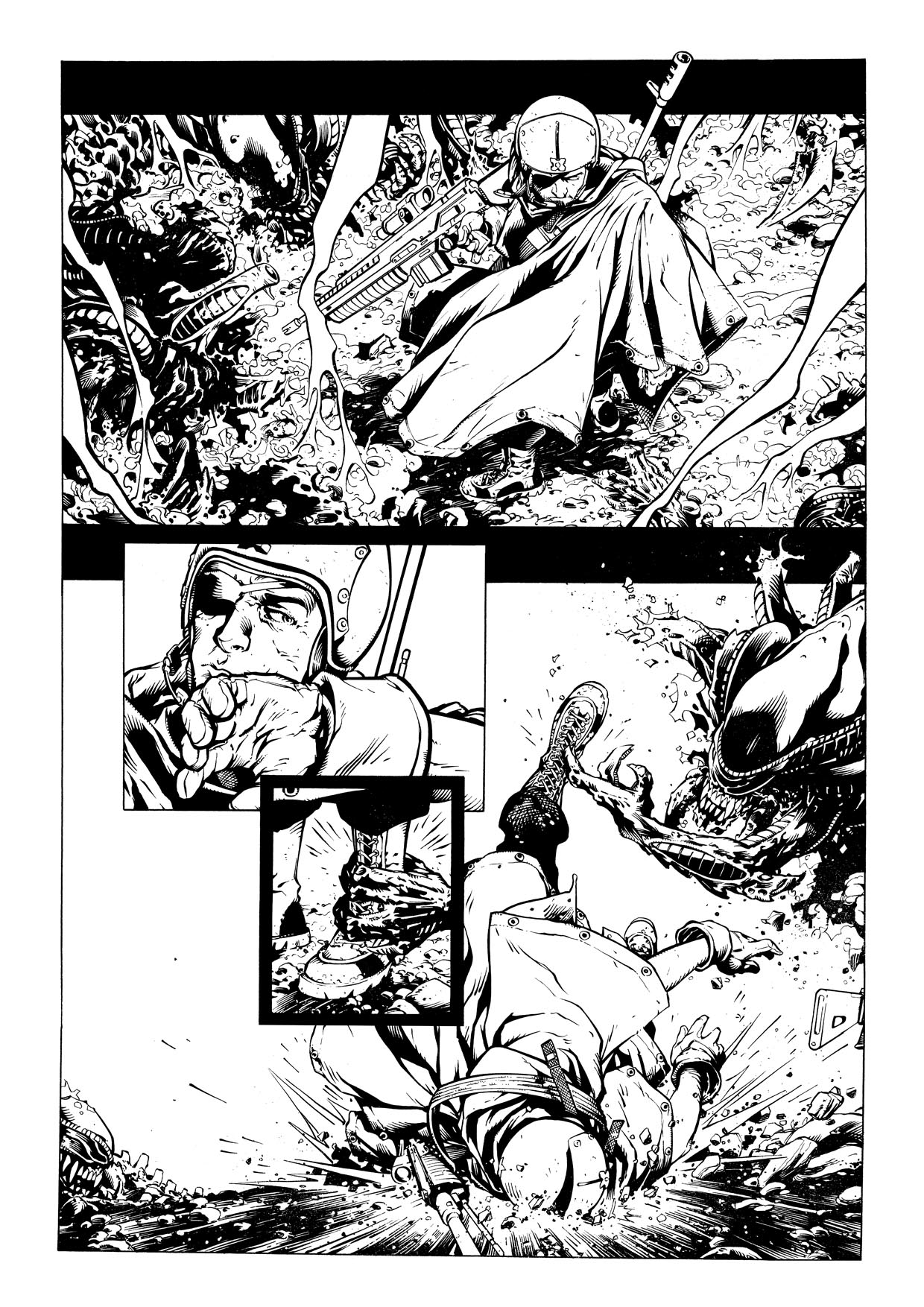
It's easy to make Gary look doughy His line work is so exposed. I dont really see where I can point a finger & say "that's where it went wrong" but Gary doesn't really fit with how you ink. To me that's not a portfolio piece for you, just more of a learning experience. I dont think you should forward this one to editors. I can see where your rendering has improved on this one, so it had value to your overall learning curve.
Jay
|
|
|
|
Post by julienhb on May 23, 2009 16:47:21 GMT -5
Thank you very much, Jay.
I would say it's too fresh for me to really tell what's good or not on this page. I'm currently finishing a second one - I'll see if it's improved a bit. Don't know yet.
But thanks once again for your C&C!
|
|
|
|
Post by clockwerkj on May 24, 2009 10:29:26 GMT -5
Yeah Keep banging away at Gary pages. Working with him on Midnight Nation pages forced me to learn alot. Especially his wrinkles & folds in clothes. They are amazingly accurate. The hard part is in the rendering. It has to be very crisp & almost stiff in order for his pages to work.
|
|
|
|
Post by julienhb on May 25, 2009 17:14:35 GMT -5
|
|
|
|
Post by clockwerkj on May 26, 2009 15:04:27 GMT -5
Same comments as the previous post. You'll get it soon enough, but this isnt a strong piece. I know you've got better stuff coming so keep it up.
Jay
|
|