|
|
Post by TomParrish on Dec 2, 2008 9:51:16 GMT -5
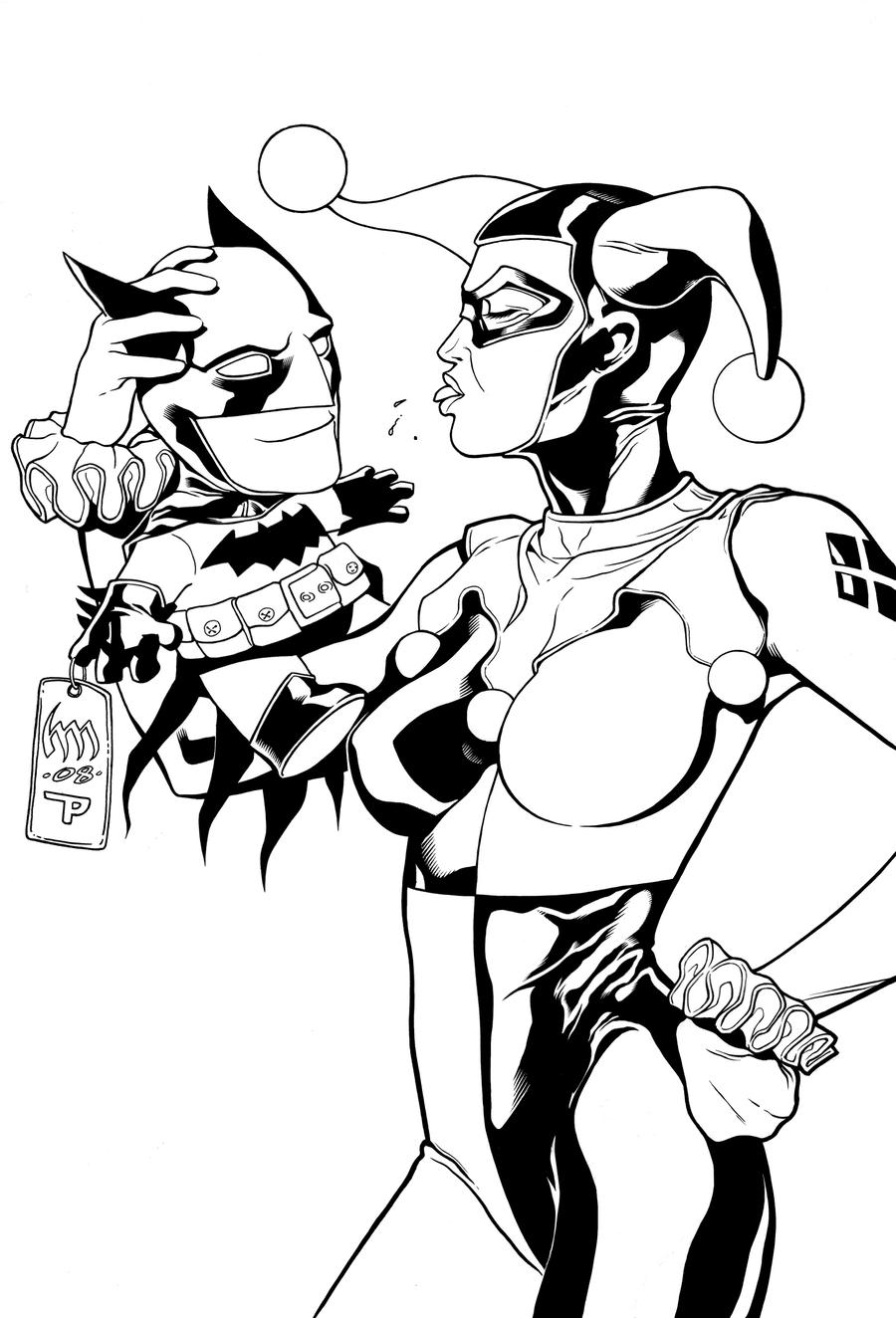
Hi Guys, Well, in the spirit of sharing works and what not I thought I'd post a couple of pieces I've inked - I'll post more as I do it! :-D  Pencils by Heubert Kahn Michael wrathofkhan.deviantart.com/ Pencils by Philip Tan  Pencils by Heubert Kahn Michael (The rock texture is HIDEOUS - was aiming for a loose almost abstract style...)  Ultimates 2 - Pencils by Bryan Hitch  Pencils by Heubert Kahn Michael |
|
|
|
Post by clockwerkj on Dec 2, 2008 18:31:43 GMT -5
I like how most of it works. I think the contour work is nice maybe push a bit heavier in places. In general tho the rendering is not very good. In terms of creating greys & tonal transitions it isnt working. If you want to show samples that get you work hunt down Jim Califiore type pages to ink. I'd steer clear of Hitch, Tan & others like that. You arent putting sample level stuff into those yet, so I'd work on those & only show those to people you want feedback from, not to try for work. That may keep you from getting work at the moment. ll your other skills are worth getting some work.
|
|
|
|
Post by TomParrish on Dec 3, 2008 5:18:02 GMT -5
Thanks so much for the feedback Jay - Jimmy has already given me a pointer on the rendering, I'll definately look out for some Jim Califiore samples (though seem to have trouble at the moment finding samples to ink!) More often than not one of the things I find the problem with rendering is combatting the indecision of how to handle various textures and grads. Is this a common issue and something that you get used to with the more pages you ink?
Once again thanks man, the C&C is really appreicated ;D
|
|
|
|
Post by jimmyt on Dec 3, 2008 17:04:46 GMT -5
I may have a couple of Jimmy C's pages I can scan. I will try to get them to you this week.
Jimmy
|
|
|
|
Post by TomParrish on Dec 4, 2008 4:57:10 GMT -5
Thanks Jimmy - that'd be really appreciated!  |
|
|
|
Post by TomParrish on Dec 12, 2008 12:46:25 GMT -5
|
|
|
|
Post by TomParrish on Dec 23, 2008 18:26:23 GMT -5
|
|
livengood
New Member
 Jerry the 'Spider-Wing' guy.
Posts: 35
|
Post by livengood on Dec 24, 2008 4:58:10 GMT -5
It still amazes me that you guys can do this with a brush. I'm having such a hard time with mine, though I did just order my very first W&N S7#2 brush and Hunt 102 Quill, so hopefully I'll be able to control a line better.
|
|
|
|
Post by TomParrish on Dec 24, 2008 9:24:16 GMT -5
I never used to understand the brush style either - I was so hung up on tech pens for ages, then I just experimented and after a couple of pages found a groove and never went back. It's wierd that I always actually wanted to use quills more, but I've got to spend a lot more time getting used to them!
I love the S7 brushes, I use no's 1-3 but 2 I find the most useful all rounder. For what it's worth, here's the two bits of advice I picked up at cons in the UK from inkers that I found useful - 1. Keep turning the page - work at the angle that gives you the easiest stroke and 2. Don't expect to throw all of your lines in one stroke, build them up in places to get the shapes you want. There are some pretty cool videos on YouTube, and the Joe Weems Gnomon DVD's pretty good too. Thought I'd share what helped me thus far anyhow - still soooooo much to learn though! (..and that's what keeps it interesting innit!)
|
|
|
|
Post by TomParrish on Jan 2, 2009 9:43:09 GMT -5
 Pencils by: Randy Green (kindly provided by Levi ) Inks by me. Really enjoyed this page, love Randy's style! Would have posted it earlier, but Xmas kinda got in the way n all. Used Speedball Superblack on this, think the first bottle I had was a dud as it was great this time round. About 90% brush (no.2), some rapidographs and some quill in places, though still prefer the brush. Can't help but think actually that this might have looked cooler done with quill completely, but it just doesn't have the same feel. One day maybe! |
|
|
|
Post by clockwerkj on Jan 2, 2009 12:10:46 GMT -5
At first glance I thought this was a really good example over a cartoon books style guy. Everything is solid in the inks. Maybe push the forground weights a bit for additional separation.
Also tho you said this was Randy Green. I dont see that at all on this page. Im not sure if Randy was going for something different or if you just took his particular style out of the equation?
It's tough to critique because it's basically sound inking, but knowing who the penciller is took some of my positivity away.
|
|
|
|
Post by TomParrish on Jan 2, 2009 13:54:05 GMT -5
Thanks Jay - I'm pretty sure it's by Randy Green (at least the file was labelled as his..) so I've posted the pencils here to check/compare etc:  Hope this helps |
|
|
|
Post by clockwerkj on Jan 2, 2009 20:56:14 GMT -5
That definately helps. It looks like he drew it knowing who was inking it. The primary thing lost in your inks is angularity. the sharpness of direction changes. It's not worth working back into, as I dont think you are far off from what you were given. I typically give beginning inkers looking for samples, the "tight" Randy Green stuff. Email me offline & I will send you a few things that may be useful to ya. I think you are beyond the Training Wheels stage so theres probably pencil samples better suited to you, & may prove more challenging. I'd revisit Randy Green in a year or so when you reach the plateau of being ready for work but not getting any.
clockwerkj@mac.com
|
|
|
|
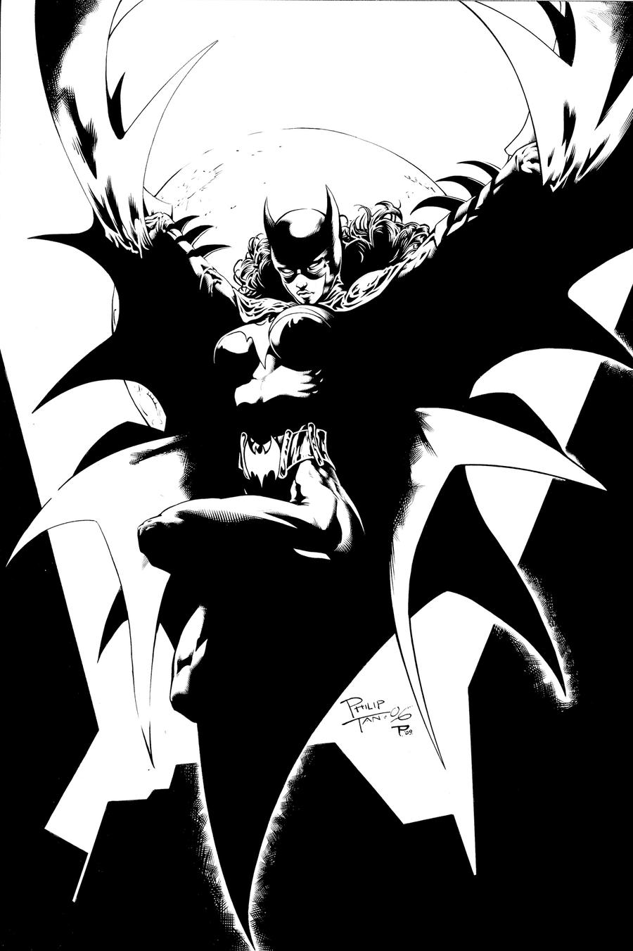
Post by TomParrish on Feb 15, 2009 14:11:01 GMT -5
 Finally got round to finishing this page (been sat at about 90% for a couple of weeks due to work etc) - another Philip Tan page that I thought looked cool. His stuff I find REALLY challenging, so it's more of an educational piece than anything else. |
|
|
|
Post by clockwerkj on Feb 20, 2009 15:20:43 GMT -5
Phillip Tan is on every-ones to do list lately. I think its very nice. Lineweights, where actually viewable on the edges of the cape is too inconsistent. You should never break a line on both sides of the same object.
|
|