|
|
Post by clockwerkj on Oct 20, 2009 9:00:27 GMT -5
never go up & down on boobs like that. It makes them look like fake overstufts that show wrinkles in em under pressure. If you have ever seen fake boobs on a bodybuilder? Round the form if you have to, but in general leave it out.
|
|
|
|
Post by tschloendorn on Oct 20, 2009 12:09:02 GMT -5
I'll keep that in mind for next time. Here's some new things fresh off the table. First up is one penciled by Mike DeBalfo. 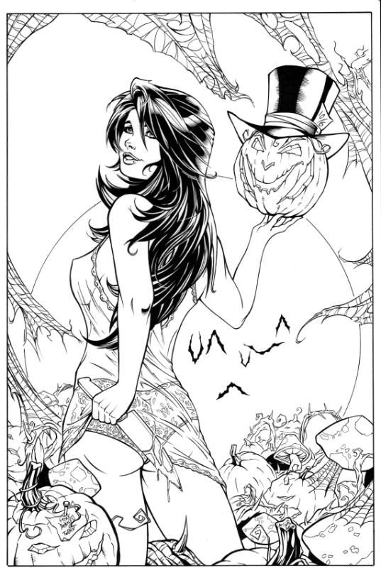 Next up is some from Jeremy Dale 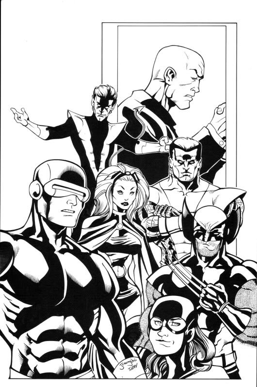   |
|
|
|
Post by clockwerkj on Oct 23, 2009 19:35:42 GMT -5
you and jeremy make a good pair. keep it up. nothinh really to pick at here.
|
|
|
|
Post by tschloendorn on Nov 18, 2009 11:14:49 GMT -5
Here's a couple I just finished up. First up a Dave Finch homage to the old McFarlane Hulk cover. 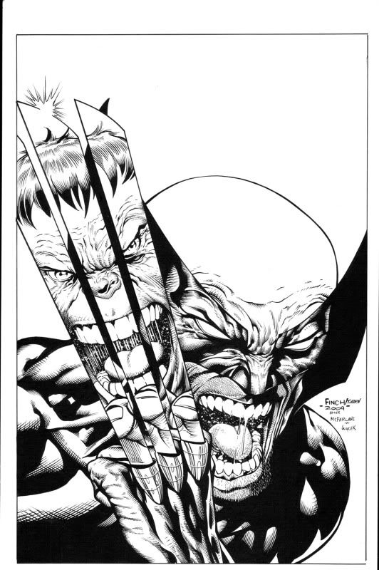 Next up is by Kevin Sharpe that I found on his Deviant gallery,and wanted to try a little ink wash. 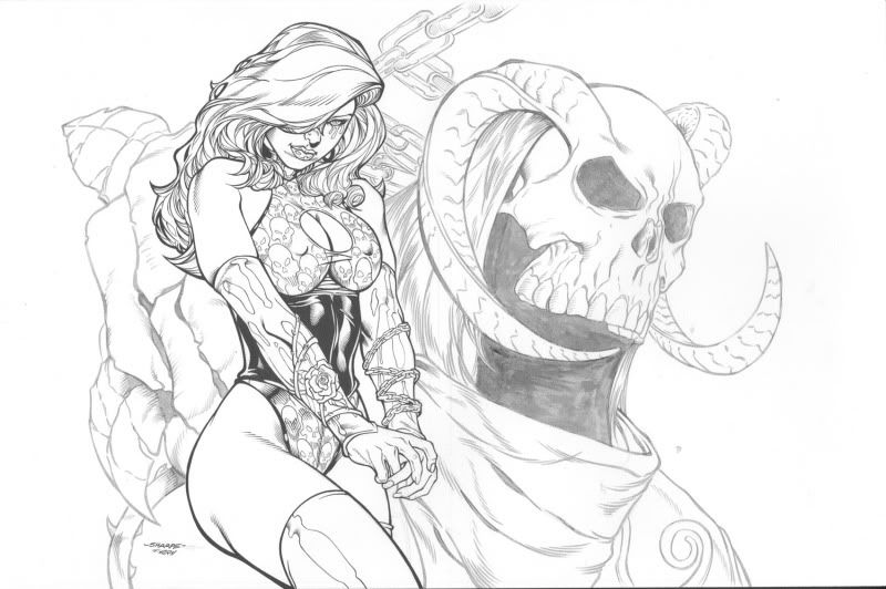 As always let me know what you think. |
|
|
|
Post by clockwerkj on Nov 18, 2009 20:52:48 GMT -5
u made Finch look more like Quesada. The lines should be ugly, wierd & sharp on Finch. Looks nice tho.
|
|
|
|
Post by TomParrish on Nov 19, 2009 5:40:40 GMT -5
Nice work man! Reminds me of Mark Morales fill in for Danny Miki on New Avengers over Finch's pencils. The ink wash work is really nice too, though maybe a slight tweak to the levels in photoshop might make it pop a bit more?
|
|
|
|
Post by tschloendorn on Nov 19, 2009 8:24:26 GMT -5
That's the one problem when I ink a Finch piece I'm to clean.If it was when I first started to ink it probably look great since I was very choppy back then.
As far as the inkwash I did try and adjust it some what but when I did it lost the softness I was going for.I'm not that good with Photoshop other than an overall smoothing out solid black areas.
Thanks for the feedback both of you.
|
|
|
|
Post by tschloendorn on Dec 5, 2009 18:08:50 GMT -5
Well it's been a bit for new stuff but here you go. These were penciled by Julio Brilha juliobrilha.deviantart.com/ 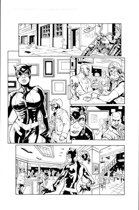 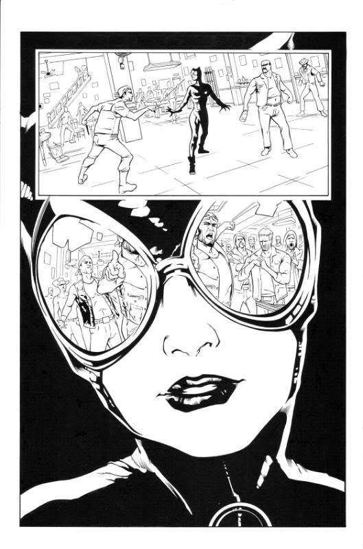 You guys are getting first crack at seeing these since i have a couple more to do but I wanted to get some feedback since these are the first from this artist that I've worked on. Let me have at it. |
|
|
|
Post by clockwerkj on Dec 6, 2009 11:04:03 GMT -5
Watch out for being too thin up front. theres some staging issues where foreground & mid-ground are the same weight or atleast so close I cant tell.
Try using a slightly thinner pen line on the far backgrounds as well.
Jay
|
|
|
|
Post by tschloendorn on Dec 13, 2009 18:29:18 GMT -5
Here's the other 2 pages from this set. 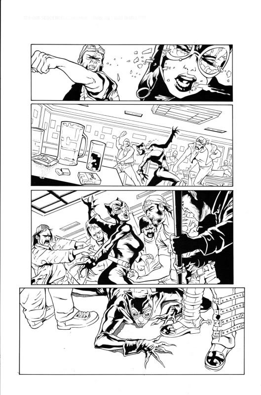 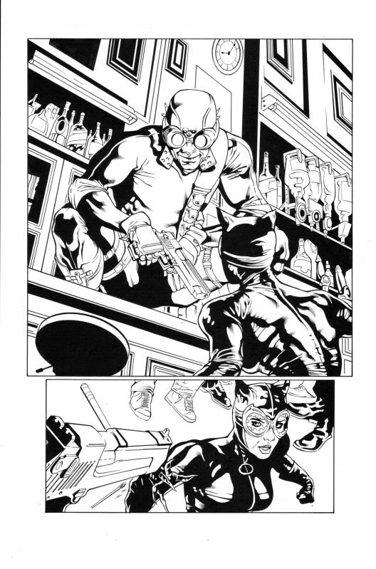 As always let me have it. |
|
|
|
Post by clockwerkj on Dec 14, 2009 8:45:04 GMT -5
Same as the previous batch. you gotta push the weights.
|
|
|
|
Post by tschloendorn on Jan 9, 2010 19:17:22 GMT -5
Well here we go first art post of 2010. Penciled by Julio Brilha. 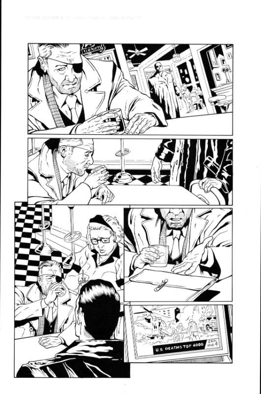 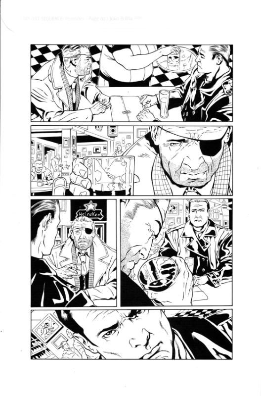 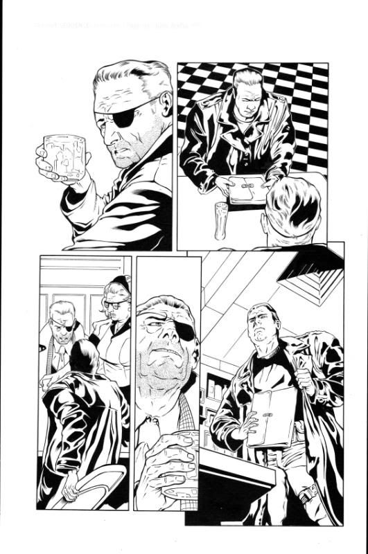 For a larger view head to my deviant gallery madman1.deviantart.com As always let me know what you think. |
|
|
|
Post by tschloendorn on Jan 19, 2010 21:07:25 GMT -5
Over last year I worked on a book called Vigilantes. Penciled by Freek Van Haagen. Here's a few select pages from the book in no particular order. Penciled by Freek Van Haagen. 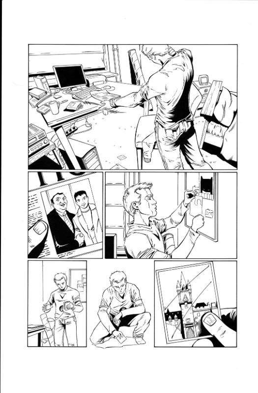 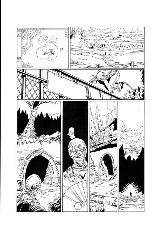 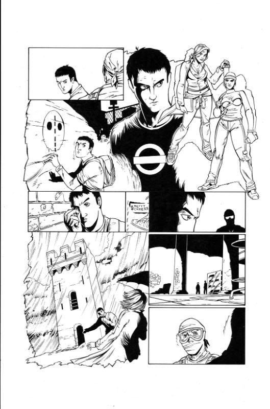 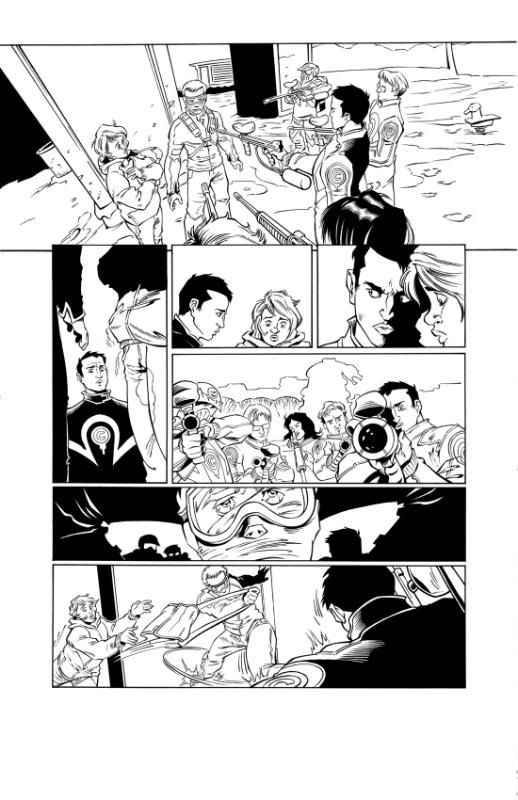 |
|
|
|
Post by clockwerkj on Jan 20, 2010 20:39:05 GMT -5
nothing much to say. I'd really have to hold them in my hands to give you tips going forward. It's not like you are trying wild styles or something to give pointers on. These guys are all very flat & straight forward.
|
|
|
|
Post by tschloendorn on Mar 2, 2010 22:04:00 GMT -5
I know it's been a while since I posted anything new,sorry about that,but work had to come first,and those I'm at liberty to show right now. In the meantime here's a few I did for my portfolio. Penciled by Steve Scott for Xmen Forever. 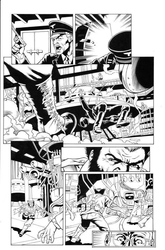 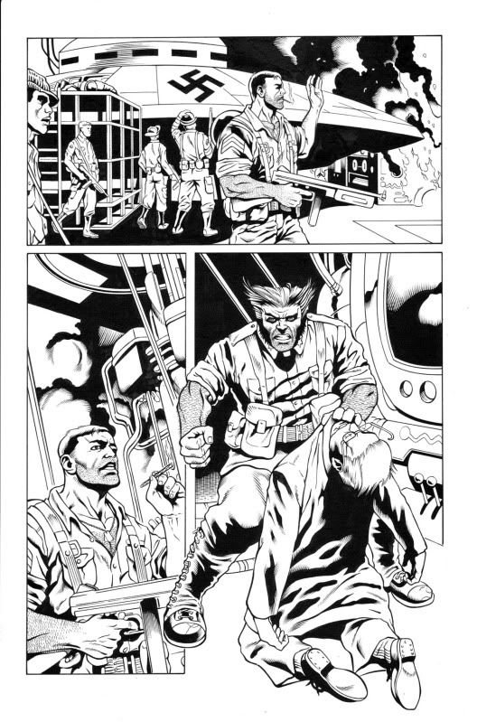 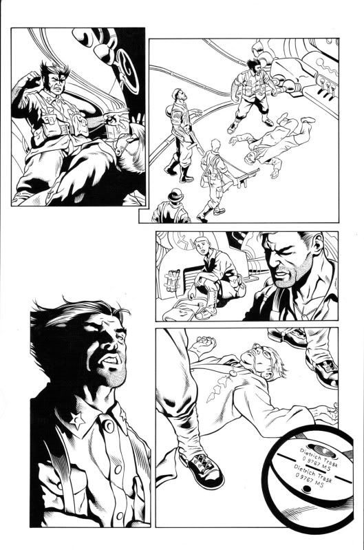 Let me know what you think. |
|
